Colors
Our palettes unite our brand and allow us to express our personality.
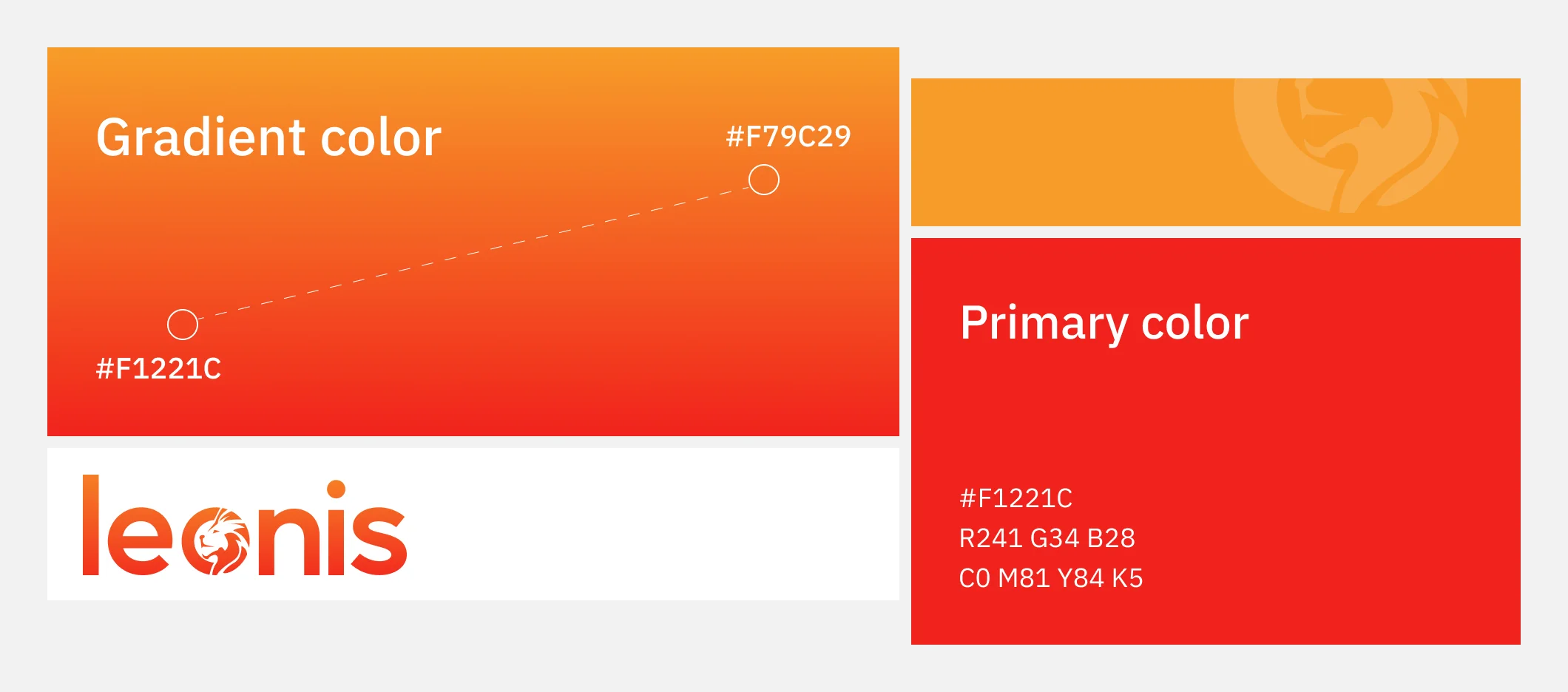
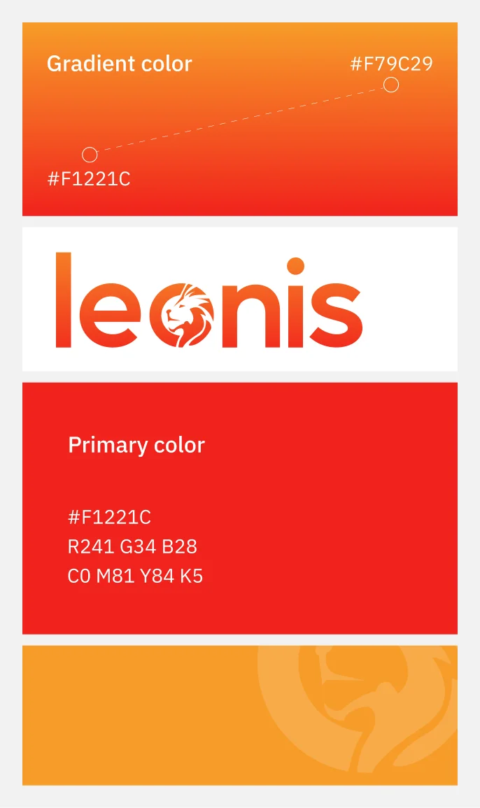
At the heart of the Leonis color palette is a striking red-orange, symbolizing energy and innovation. Paired with neutral tones, this palette conveys balance, ensuring a cohesive and memorable brand presence.
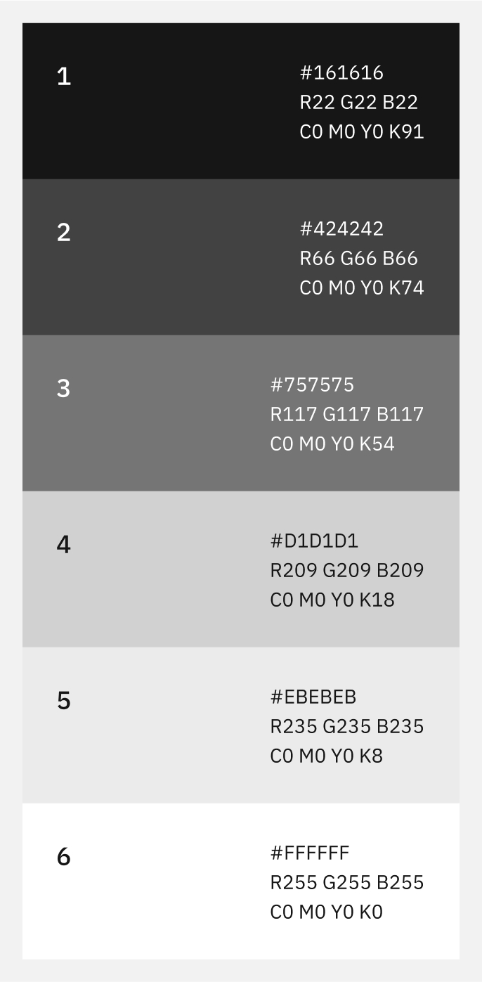
The Leonis neutral palette provides balance and sophistication, complementing our vibrant primary colors. These subtle tones enhance versatility, offering a clean and professional foundation for designs while ensuring the bold elements of our brand stand out effectively.
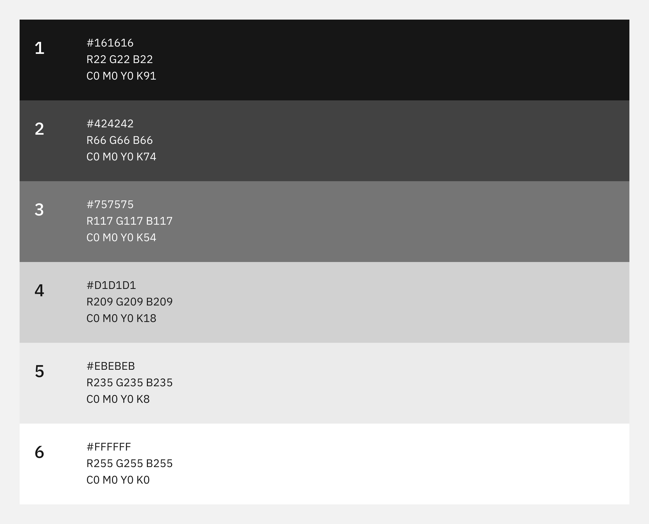
Use in most separators, for example in the section header and tabs components.
Use on the edges of images to differentiate them from the background, such as flags in avatars.
The rare color in the Leonis palette is reserved for special occasions and unique applications. This distinctive hue adds exclusivity and depth to our visual identity, used sparingly to highlight key elements and create a memorable impact.